
Spreadsheet to visualisation: How I created towing.utf9k.net
Table of contents
From time to time, I like to submit requests under the Official Information Act and see what fun datasets I can get my hands on.
A few of these projects end up on the back burner and towing.utf9k.net was no different. Before we get too far, you might want to read this brief overview about what it does to build some context.
All up, it took me something like 4 or 5 years to finally consider it “complete”, in large part because I would hit a wall and not really be sure where to go from there.
With perfect 20/20 hindsight, such a project would be very quick to complete but for those starting out in the mapping space, taking a scenic walk through the creation process should hopefully serve as a nice jumping off point for how you might approach your own projects.
Thankfully, I kept all of my “workings” like as my cobbled together Python scripts and intermediate datasets, such that we can work through them from start to finish so you can have an idea of how this fun little visualisation was made.
It’s probably worth noting that I’m not a data scientist by any means and a lot of steps could probably be made redundant if I knew better but it’s all a means to an end, and the end is pretty neat so I don’t really mind airing my dirty laundry.
Obtaining inspiration
This is probably the hardest step.
As mentioned in my brief project write up, the idea for a towing visualisation came to me when I was sitting at a cafe. I don’t imagine I would have come up with the idea any other way so it was basically a fluke.
The next best thing is seeing what other cool creations are floating around online.
Personally, most of what I’ve stumbled on has come by way of Hacker News. I didn’t realise it at the time, but I think a few of my favourites that stick out have all come from Matt Chapman.
Using FOIA Data and Unix to halve major source of parking tickets was a particularly big inspiration on this smaller project of mine which ended up going in a different direction than what he had put together.
Looking back at it after all these years, and having a few pieces under my belt, I feel like there’s even more to improve in my own process so writing this post in itself has already been a big win for me.
Anyway, all this to say: As is usually the case, starting is often harder than any other part of the process.
Once the ball is rolling, you may hit some hard problems but I find it’s usually rare that they’re difficult in the sense of an immovable object. It’s more that it’s just a lot of work or figuring out the right terminology to use in a search query that will get you a step closer to the right tool.
Let’s actually take a look at the project in more detail.
Obtaining our dataset
This part varies depending on what type of data you’re looking for and depending on the country you’re in.
Here in New Zealand, we have the Official Information Act which defaults to everything being open unless there is a good reason for it not to be.
On top of that, we have some pretty proactive agencies continuously publishing interesting datasets so not everything necessarily requires a formal request either.
In my case, I was after data about vehicles that were towed in Auckland City which is not readily available, at least as far as I’m aware.
Finding the correct authority can be a bit of a wild goose chase when you’re first starting out but most agencies should be pretty helpful in letting you know where the data you’re after might be held.
Initially, I did a search for auckland transport towing which surfaced this page and I noticed an interesting mention near the bottom.
AT contractors and private towing companies must notify police when they have towed a vehicle. They are required to provide the licence plate number and location they have moved the vehicle to.
I figured contacting the New Zealand Police might be worth a shot in case they happened to hold more comprehensive information than Auckland Transport themselves.
In the end, they transferred my request to a LGOIMA1 Business Partner which I wouldn’t have known was the right place, but most agencies are pretty good at redirecting you where you should go like that.
You can read the full correspondence to get an idea of how to structure a request, what some of the back and forth might look like, and to get a copy of the dataset.
With our dataset on hand, let’s fire it up and take a look at what we’ve got to work with.
Making our dataset palatable
Opening up Marcus Aug 2016 Jul 2019.xlsx certainly leaves a lot to be desired.
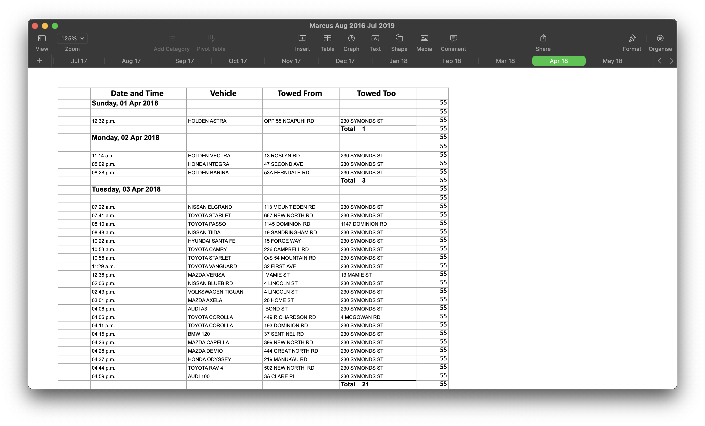
With just an initial glance, we can already spot a bunch of pain points with this data set:
- This dataset will be hard to query programmatically. In the
Date and Timecolumn for instance, we have a mix of times and dates. If you were to take a random row, you would need to step backnnumber of rows to figure out the date and then apply that date to each row going forward, until you hit the next cell that resembles a date. - Addresses do not have much consistency.
- Some addresses include street numbers while others do not.
- None of them contain suburbs so we may have address clashes with no way to know the “correct” one
- Terms like
OPPin the case of “Opposite 55 Ngapuhi Road” which don’t tell us anything useful.
- The file column contains numbers that we need to map to something meaningful
- At least two visible entries have a vehicle starting from the same street they end up in
- Perhaps they were towed around the block or moved to unblock something? The data doesn’t say so we can only assume.
For the first iteration of this project, I decided to ignore any information that would be hard to interpret so missing street numbers and the like were put to one side just to get things moving.
For this step, I reached for Python and Pandas to create a hacky script that brute forced this dataset into something nice and easy to play with.
Python is generally nice for these sorts of explorations, not only because it has a strong data science library but the lack of strong typing makes it easy to cludge together a project when your underlying data is a complete mess, structurally speaking.
The entire process was detailed step by step on my blog a few years back. I had gotten as far as tidying the data but was a bit stumped on how to make anything usable out of it at a time.
For the impatient, this script is all you need to skim.
Let’s jump ahead to the end of that post which leaves us with a sqlite database called towing.db.
Geocoding - what is it?
While we have a nice queryable list of addresses, they don’t actually mean anything to us in plain English. What we really want is a list of coordinates that we can plot on a map.
The process of taking an address and transforming it into a set of coordinates is known as Address geocoding, or just “geocoding” for short.
While we aren’t doing it in this project, it might be interesting to know that the reverse process of taking a set of coordinates and turning it into the nearest address is called Reverse geocoding
So, how do we go about geocoding?
Well, there are a few geocoding providers that you could turn to but we have a pretty sizeable dataset:
sqlite> SELECT count(*) FROM events;
count(*) = 49174
If we look at HERE Maps as an example, our dataset falls within the 30,001 to 5,000,000 requests/month category giving us a cost of 0.830 USD per 1000 requests.
We’ll round it up to 50,000 to account for some API failures and network connectivity issues on our end and we’re looking at around $40 USD. Admittedly, that is a lot cheaper than I remember. Perhaps the prices have come down a lot since I last looked?
In the case of Mapbox, it seems this would even fall within their free tier so I would probably just go that route if I was starting from scratch.
The other thing to consider is how many requests can you make before hitting a rate limit since you have to send every address across the wire, whether batched or otherwise.
In our case, we’re going to do it all locally for free in exchange for a bit of elbow grease.
Geocoding - Doing it in practice
First, we need a dataset that will translate addresses to coordinates.
Here in New Zealand, Land Information New Zealand provides this and many other datasets for free, by way of the LINZ Data Service.
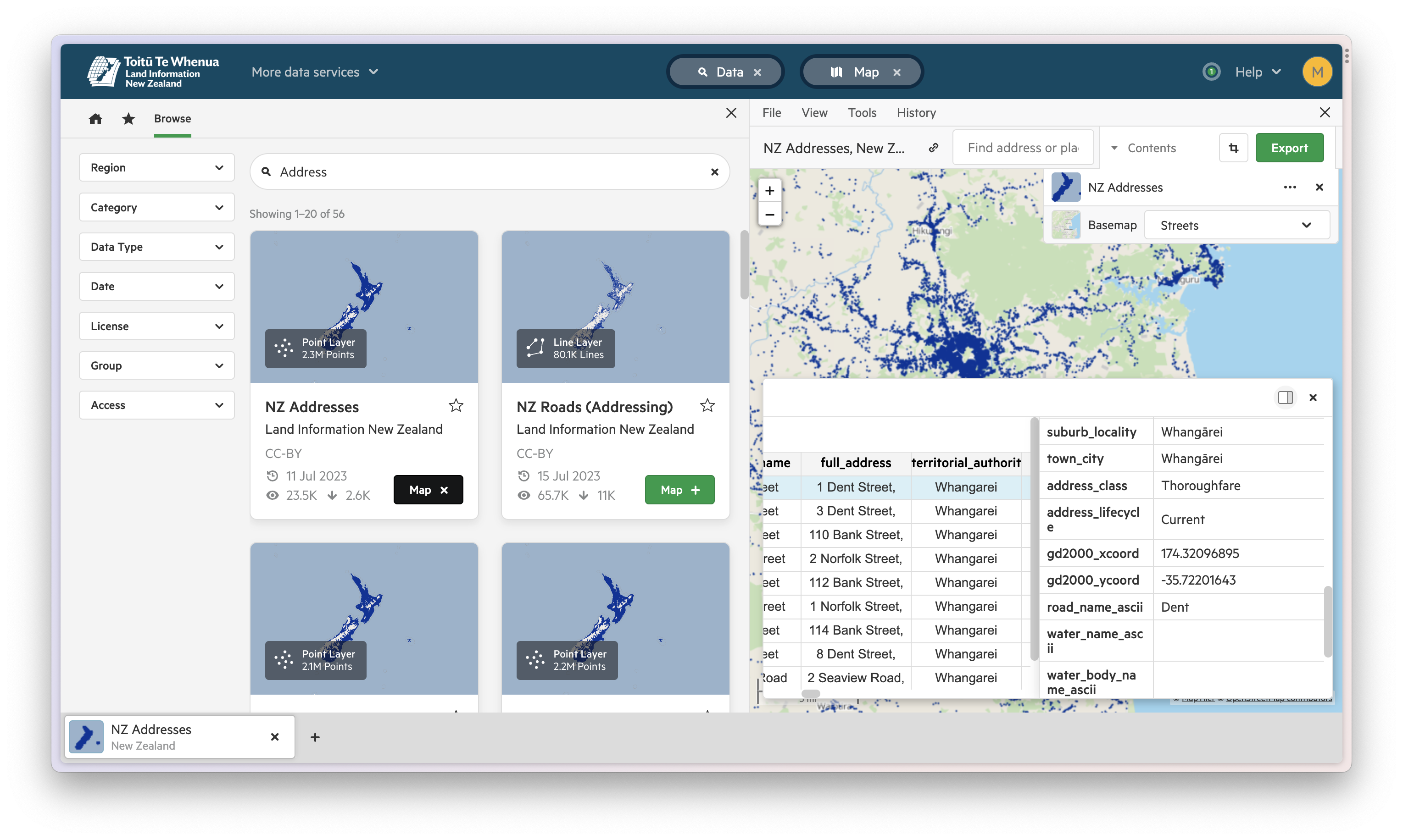
What we’re looking at is one data point for each address in New Zealand that contains both the address broken into its component parts as well as the coordinates for that address.
To get started, we’ll download the dataset as a CSV and using sqlite-utils from the Datasette project, we can insert the contents into our existing sqlite database which will let us perform joins between our two datasets down the line.
A quick way to “geocode” is to just take all these addresses and then do a rough lookup to find an address that matches each one of our towing addresses. All that’s left is to check the associated coordinates if we get a match.
These days, I would probably look at Pelias as a middle ground although I haven’t used it before.
With a bit more data munging, we have a script that does exactly that.
In order to improve the odds of a match occurring, I added in some brute force checks to transform the most common abbreviations into their full names such as st becoming street.
This process was quite lossy, as seen by the number of addresses that I wrote out to a text file containing failed translations.
Given the sheer number of originating data points, I didn’t worry about this too much since there’d be more than enough results to play with but it might be interesting to fix up a lot of the leftovers sometime.
Lastly, our matching pair of addresses were output to a CSV file for quick lookup in the next bit of the process.
This probably isn’t necessary but I figured that it would allow for quicker lookups iterating through a CSV file than having to perform joins between our two tables for every event. As with all things in this messy process, as long as it gets us to our final destination, doing it “right” doesn’t matter too much.
Translating our coordinates into routes
We now have a set of start and end coordinates that represent where a vehicle was towed from and where it ended up.
This is a good start but if we were to plot these on a map and then start simulating traffic between those two points, we would get something silly like this.
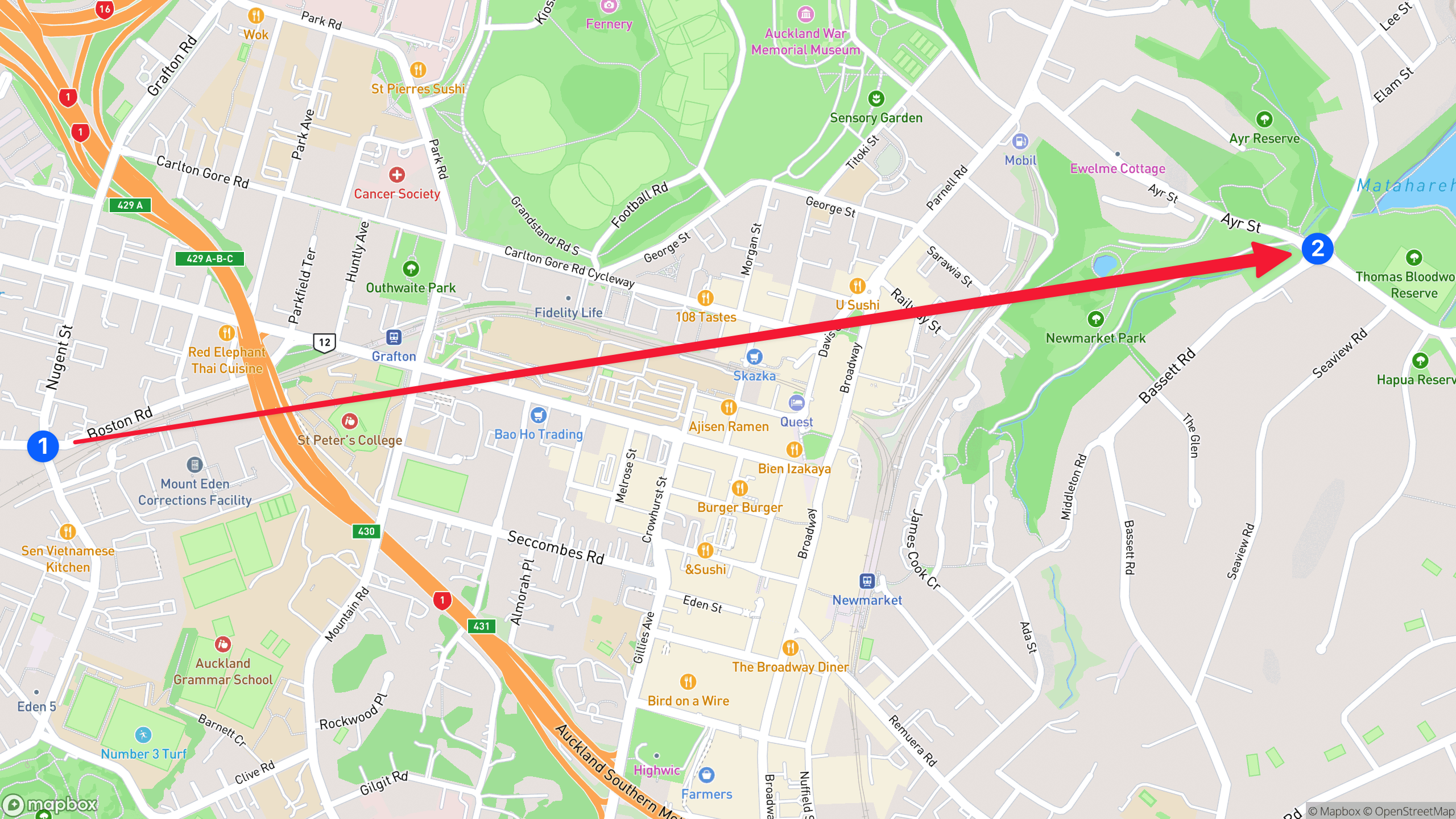
It goes without saying that cars don’t work this way in real life, just cutting through buildings and chunks of lands, so we somehow need to simulate the route that a vehicle is most likely to take so we have something more like this.
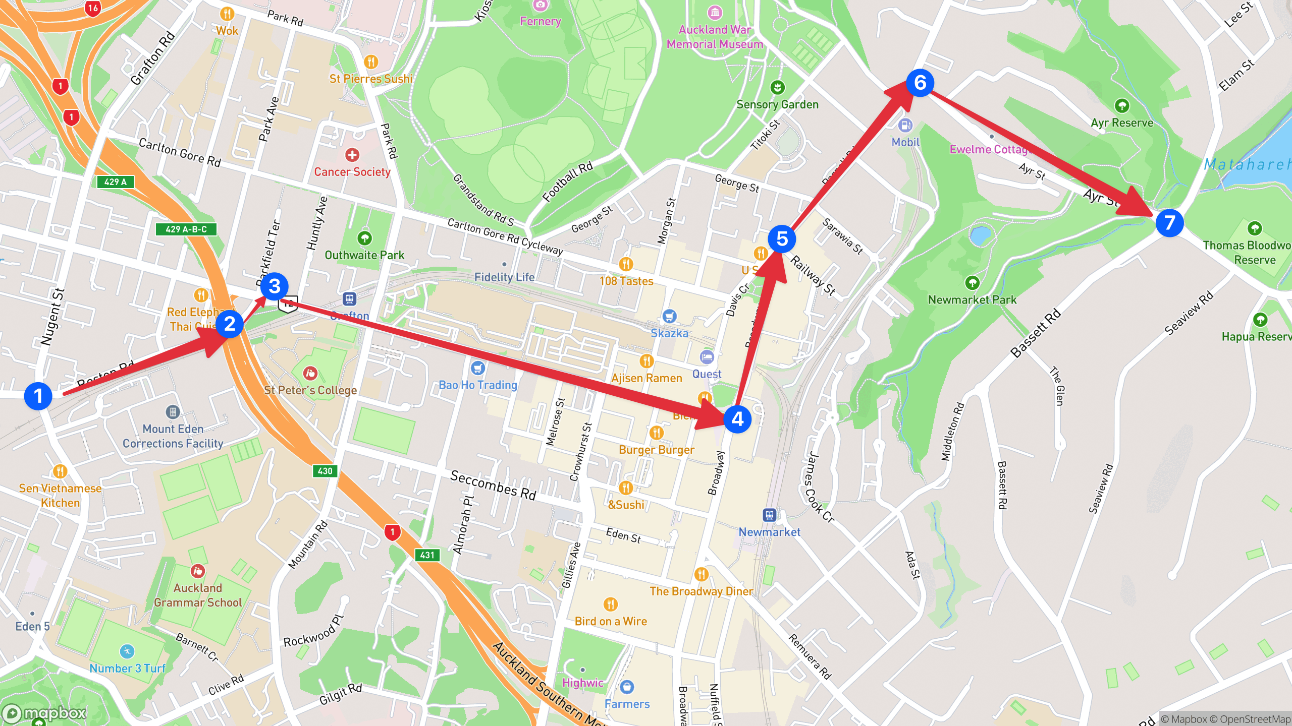
Figuring out how to generate routing data was a massive blocker for this project for a long time until I discovered the existence of openrouteservice.
In short, it’s a Java service that can be run locally in order to generate routing information. Better yet, it has a JSON API where you can submit coordinates and receive back structured routing information which is exactly what we need.
We specifically want the /ors/v2/directions/driving-car endpoint to generate direction for a car.
If you wanted to go even further, it might be interesting to gather average traffic data to simulate the speed to might take to drive down any given road but to make life easier, I just generated some fake timestamps that incremented by 2 seconds for each route.
Part of this is because the routes are actually very detailed, even more so than we need for our visualisation so we end up with a lot of navigation directions.
With all this in mind, we can put together another script that slowly iterates through our dataset and saves the resulting output into a file called routes.json.
It has a bit of a weird format but don’t read too much into it. It’s just specific to the visualisation library that we’re going to talk about next.
Putting together our visualisation
There are a great deal of visualisation tools out there but one I had been meaning to try for some time is deck.gl, a WebGL framework by Uber.
Particularly, I had come across their TripsLayer demo some time back. I don’t recall but I probably saw the demo and thought it was exactly what I had in mind for how a representation of this towing data might look.
It turns out that the source code for all of the demo is available, including TripsLayer, so rather than reinvent the wheel, I took what was already released and restructured my dataset to fit.
I did rip out some bits of the source code and made other tweaks but for the most part, the fundamentals didn’t change greatly.
With our routes.json file generated in the last step, plugging the new data set in and spinning up the project gave us a nice, albeit a bit boring map to look out.
Our project was complete… or was it?
Unfortunately, due to the sheer number of data points in the graph, the visualisation was sluggish at best and near unusable on mobile.
it didn’t stop me from publishing the project and sharing it around with some colleagues but I was never quite happy with it.
Fast forward another year and I finally sat down to make some performance improvements.
Cutting through the acres of data points
There wasn’t much of a diagnosis to make other than “There’s too much dang data”.
Rather than try anything fancy, I continued the theme of the brute force approach and took a machete to the dataset, slimming it down greatly.
Breaking from tradition, I wrote a quick program in Go because I felt that it would have a better change of succeeding in a reasonable time frame than something based in Python, not to mention we now had a well-structured dataset to make life easier.
At a high level, the script kept the first and last data points for each route taken and randomly deleted all of the points in between until just 10 were left.
This seemed like it would break everything but it had the reverse effect. Not only did the performance greatly improve but the graph looked much cooler as well.
Lessons learned
Doing this whole exercise exposed me to a lot of new mapping concepts such as geocoding, visualisation, route generation as well as some various tools for munging together data.
I would say I’m glad I didn’t give up but more than anything, this project was an open loop in my mind that had finally beaten me, and that will usually always be enough to keep me coming back for more punishment.
Perhaps the coolest outcome is that because it’s visual, you can pop up a project like this on your phone and show people who might think it’s cool without necessarily having much background into what’s going on.
It’s probably the one category of programming I do that’s closest to art in any sense which always helps to keep the perpetual motion machine running.
I just wish it was easier to come by good ideas!
Anyway, hopefully you learned something useful reading this post and if you come across any better tools that I could have made use of earlier, please don’t hesitate to let me know at hello@utf9k.net.
Happy mapping!
-
The Local Government Official Information and Meetings Act can be thought of as an Official Information Act for local city councils. Sometimes, councils will try to get out of their obligations ↩︎